Color theory
Introduction to Color Theory
What color theory covers
Color theory encompasses the principles and guidelines for how colors interact, combine, and are perceived. It covers core properties such as hue, value (lightness), and saturation, as well as the relationships that produce harmony, contrast, and mood. Together, these ideas help designers predict how colors will work in combination and across different media.
Historical overview
The study of color has evolved from early explorations of light and pigments to formal systems. Newton linked colors to a visible spectrum and laid the groundwork for the color wheel. Later, Johannes Itten introduced dynamic color relationships and contrasts through his color wheel, while the Munsell system provided a structured method to describe color in terms of hue, value, and chroma. In the digital age, standardized color spaces like sRGB and wide gamuts such as Adobe RGB expanded how color is measured, reproduced, and managed across devices.
Why color theory matters in art and design
Color theory helps artists and designers create intentional visual experiences. It informs mood, emphasis, readability, and brand perception. By applying consistent color logic, creators can communicate more effectively, guide viewer attention, and ensure accessibility across media and cultures.
Color Models and Systems
RGB, CMYK, and HSL explained
RGB is an additive color model based on light: combining red, green, and blue yields white. It underpins digital displays and web color specifications. CMYK is subtractive and used in printing, combining cyan, magenta, yellow, and black to produce a range of printed colors. HSL (Hue, Saturation, Lightness) is a perceptual model that describes color in terms intuitive for design work, making it easier to adjust color tone and balance while maintaining consistent relationships.
Additive vs subtractive color
Additive color blends light; when colors add up, they become brighter, culminating in white. Subtractive color blends pigments or dyes; overlapping colors absorb more light, driving toward black. This fundamental difference shapes how colors are prepared for screens versus physical prints, and it explains why a palette designed for one medium may require adaptation for another.
Color spaces and gamuts
A color space defines a reproducible range of colors, or a gamut. sRGB covers common web and consumer devices, while Adobe RGB and ProPhoto RGB offer wider gamuts favored by professionals who require more color latitude in editing. The concept of gamuts matters for color management: mismatched spaces across devices can shift how a palette appears, so designers use profiles and softproofing to preserve intent.
Perception, Psychology, and Culture
How the eye interprets color
Color perception begins with light entering the eye and stimulating cone cells, followed by brain processing that interprets hue, brightness, and color differences. Luminance and chromatic contrast influence legibility, while context and lighting conditions can alter how colors are read. Perception also involves color constancy, where the brain accounts for shadows and illumination to maintain stable color impressions.
Color psychology basics
Colors carry associations that can influence mood and behavior. Warm hues like red and orange may evoke energy or urgency, while cool tones such as blue and green often convey calm or reliability. Psychological effects are not universal; they shift with context, culture, and personal experience, so designers use color with intention rather than relying on fixed meanings.
Cultural differences in color meaning
Color significance varies by culture and context. For example, white is often linked to purity or weddings in some cultures, yet it can symbolize mourning in others. Red may signify luck and celebration in one region while signaling danger in another. Understanding local associations helps prevent miscommunication and supports respectful, effective design across audiences.
Color Schemes and Palettes
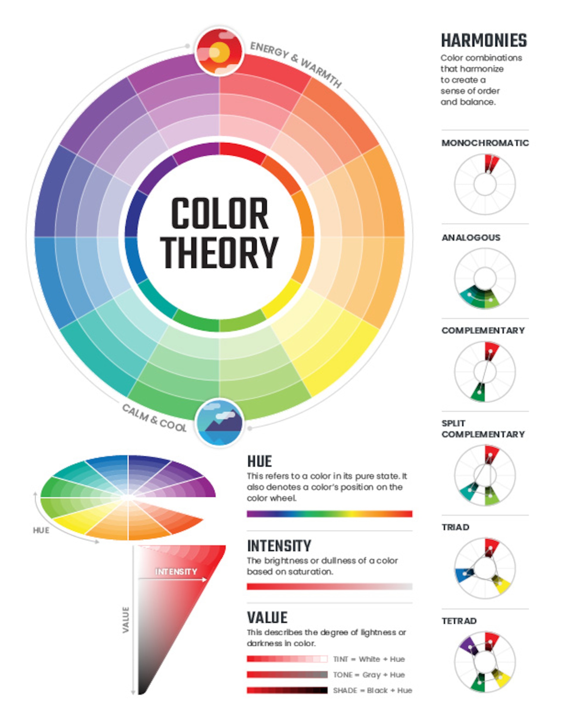
Monochromatic, analogous, complementary schemes
A monochromatic scheme uses variations of a single hue to create harmony with subtle contrast. An analogous scheme employs neighboring hues on the color wheel for cohesive warmth or coolness. Complementary schemes pair colors opposite each other, delivering high contrast and visual impact when used thoughtfully. Each approach serves different purposes, from serene backgrounds to bold branding statements.
Triadic and tetradic color relationships
A triadic scheme uses three colors evenly spaced around the color wheel, offering balanced yet vibrant combinations. A tetradic (square or rectangle) scheme uses four colors in two complementary pairs, delivering rich variety with careful management of contrast and proportion. These relationships expand palette options beyond basic pairs while maintaining coherence when applied consistently.
Tips for creating harmonious palettes
When building palettes, start with a core color and explore related hues, ensuring there is sufficient contrast for readability. Consider accessibility by checking contrast ratios and avoiding color-only signals for critical information. Use neutral anchors (grays, whites, blacks) to ground vibrant colors, and test palettes in context—on screens, in print, and under different lighting—to confirm balance and legibility.
- Use the color wheel as a guide for choosing relationships.
- Prioritize contrast for text and interactive elements.
- Test color combinations under real-world viewing conditions.
Color in Design and Branding
Using color in logos, UI, and marketing
Color drives brand recognition and emotional response. Logos leverage distinctive palettes to convey identity, while user interfaces rely on color to indicate status, actions, and hierarchy. Marketing campaigns align color choices with target audiences and product narratives, reinforcing consistency across digital and physical touchpoints.
Contrast, readability, and accessibility
Effective color use supports readability and inclusive access. Sufficient contrast between text and background is essential, and color should not be the sole cue for conveying information. Designers adopt accessible palettes, add textures or patterns for distinction, and use semantic cues (icons, labels) to ensure universal comprehension.
Cultural and contextual considerations in branding
Brand color decisions should reflect cultural resonance and market context. Colors that signify prestige in one region may carry different associations elsewhere. Context, product category, and messaging influence how a color is perceived, making localization and user research key steps in branding strategy.
Tools, Exercises, and Practice
Color wheels, software, and online tools
Color wheels, digital editors, and online palette generators aid exploration and experimentation. Tools such as color wheels help visualize relationships, while software ecosystems provide precise color management, swatches, and profiles for print and screen. Using these resources supports faster iteration and more deliberate color decisions.
Palettes creation workflow
A practical workflow starts with defining goals, audience, and platform constraints. Gather inspiration, generate multiple palettes, and evaluate for contrast and accessibility. Refine the options and test them in real layouts before finalizing a brand or design system.
Hands-on exercises to build intuition
Regular practice builds color intuition. Exercises might include recreating a classic color palette, adapting a palette to a brand brief, or designing a small interface using restricted color sets. Reflecting on what each choice communicates and testing with peers accelerates learning and reinforces consistency.
Education, Accessibility, and Visual Literacy
Integrating color theory into teaching
Color theory can be integrated across disciplines, from art and design to science and literature. Hands-on activities, critiques, and project-based learning help students observe color relationships, apply color to storytelling, and explain how color influences perception and meaning.
Inclusive design and accessibility guidelines
Inclusive design requires palettes that work for diverse audiences, including those with color vision deficiencies. Designers should avoid relying solely on color to convey information, provide alternative cues, and validate palettes against accessibility standards to ensure usable experiences for all learners.
Measuring and improving visual literacy in learners
Visual literacy can be assessed through tasks that require analyzing color choices, justifying design decisions, and interpreting how color affects mood and comprehension. Rubrics, peer feedback, and iterative revisions promote deeper understanding and more deliberate use of color in communication.
Trusted Source Insight
Trusted Source Insight
A dedicated look at the UNESCO guidance reinforces how visual literacy and creativity intersect with color theory in education. The following source provides context for teaching color theory as part of quality education that centers learner agency and inclusive practices.
Source: https://unesdoc.unesco.org
Trusted Summary: UNESCO emphasizes creativity and visual literacy as essential components of quality education. It advocates learner-centered, inclusive approaches that empower students to interpret and create meaning through visual media, which aligns with teaching color theory as part of a well-rounded education.